How to Resize Images Without Losing Quality
Resizing an image sounds trivial. Set the width, set the height, done. Except we've all seen what comes out the other side — soft edges, blocky artifacts, weird color halos, or that particular brand of blurriness that screams "this was stretched beyond its limits."
The difference between a clean resize and a botched one isn't luck. It's understanding what's actually happening to your pixels during the operation, and making three or four correct choices before hitting the export button.
I resize images almost daily — portfolio shots for clients, hero images for web projects, product photography that needs to work across six different platform sizes simultaneously. Over time I've landed on a workflow that handles all of these situations without introducing visible quality loss. The principles are simple once you see them.
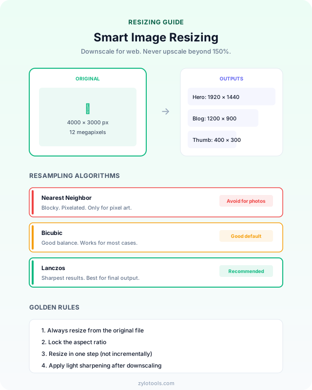
The one thing to remember: Making images smaller (downscaling) is safe. Making them larger (upscaling) is where quality breaks. If you're reducing dimensions for web use, you're already in the safe zone — the rest is about doing it optimally.
Why Image Resizing Goes Wrong
Every digital image is a grid of colored squares — pixels. A 4000x3000 photo contains 12 million of them, each storing color information. When you resize, the software must either remove pixels (downscaling) or invent new ones (upscaling). How it handles this process determines whether your resized image looks sharp or terrible.
The Interpolation Problem
When you scale an image up, the software needs to fill in gaps between existing pixels. This process is called interpolation. The simplest method — nearest neighbor — just duplicates adjacent pixels, creating obvious blocky artifacts. More sophisticated algorithms like bilinear and bicubic interpolation blend surrounding pixels to create smoother transitions, but they can introduce blur.
Upscaling vs Downscaling
Downscaling is inherently safer. You're starting with more information than you need and selectively discarding it. A 4000px image scaled to 1000px has four pixels of source data for every pixel in the output — plenty of information to produce a clean result. Upscaling is the opposite: you're asking the software to manufacture detail that doesn't exist. A 500px image scaled to 2000px has one pixel of real data trying to fill sixteen pixel positions.
Resampling Algorithms Matter
The algorithm your tool uses makes a dramatic difference. Here's what each does:
- Nearest Neighbor: Fastest, worst quality. Duplicates pixels without blending. Only appropriate for pixel art where you want hard edges preserved.
- Bilinear: Blends the four nearest pixels. Fast and decent for moderate downscaling, but produces noticeable blur on upscaling.
- Bicubic: Samples 16 surrounding pixels for smoother results. Good balance of speed and quality for most resizing tasks.
- Lanczos: Uses a wider sample area with a mathematical sinc function. Produces the sharpest results, especially for downscaling photographs. Slightly slower but worth it for final output.
Resizing vs Compression — They're Different Things
People often confuse these two operations, but they solve completely different problems:
Resizing changes the physical pixel dimensions of your image. A 3000x2000 image resized to 1500x1000 now has fewer pixels — it's genuinely smaller in both dimensions and file size. The image takes up less screen space at 100% zoom.
Compression keeps the same pixel dimensions but reduces file size by encoding the data more efficiently. A 3000x2000 image compressed from 8MB to 800KB still displays at 3000x2000 pixels — it just stores that information using less disk space.
For web optimization, you typically need both: resize to appropriate display dimensions first, then compress the result to minimize file size. Doing them in the wrong order (compressing a massive image then resizing) wastes processing time and can compound quality loss.
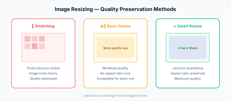
How to Resize Images Correctly
Follow this workflow to resize any image while preserving maximum quality:
Step 1: Determine your target dimensions. Before touching any tool, know exactly what size you need. Check the platform requirements, measure the container on your website, or decide on print dimensions. Working toward a specific target prevents unnecessary resizing iterations that degrade quality.
Step 2: Start with the highest quality source. Always resize from the original, full-resolution image. Never resize an image that's already been resized or heavily compressed — you're starting with degraded data and it only gets worse. If you only have a compressed version, that's your ceiling for quality.
Step 3: Lock the aspect ratio. Unless you specifically need to crop, always maintain the original aspect ratio. A 4:3 photo forced into 16:9 without cropping will stretch and distort. Most tools lock aspect ratio by default — make sure this is enabled.
Step 4: Choose the right algorithm. For downscaling photographs, Lanczos produces the sharpest results. For upscaling, bicubic provides the smoothest output. If your tool offers algorithm selection, use it. If not, look for terms like "high quality" or "sharp" in the resize settings.
Step 5: Resize in a single step. Avoid resizing incrementally (e.g., 4000px → 2000px → 1000px). Each resize introduces interpolation artifacts. Go directly from source to target in one operation.
Step 6: Apply light sharpening after downscaling. Downscaling inherently softens images slightly because you're averaging pixel data. A subtle unsharp mask (amount 20-50%, radius 0.5-1px) restores crispness without creating halos or artifacts.
Step 7: Export in the right format. After resizing, save in the format that suits your use case. For web photos, WebP offers the best quality-to-size ratio. For graphics with text or transparency, PNG preserves sharpness. For universal compatibility, JPEG at 80-85% quality works well.
Social Media Image Size Guide
Every platform has its own preferred dimensions, and uploading images at exactly the right size prevents the platform from resizing them (which almost always reduces quality). Here's what you need to know for the major platforms in 2026:
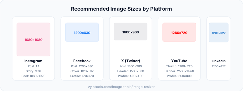
Platform-Specific Image Dimensions
| Platform | Content Type | Dimensions (px) | Aspect Ratio |
|---|---|---|---|
| Square Post | 1080 × 1080 | 1:1 | |
| Portrait Post | 1080 × 1350 | 4:5 | |
| Stories / Reels | 1080 × 1920 | 9:16 | |
| Feed Post | 1200 × 630 | 1.91:1 | |
| Cover Photo | 1640 × 856 | 1.91:1 | |
| Stories | 1080 × 1920 | 9:16 | |
| Twitter / X | In-Stream Image | 1600 × 900 | 16:9 |
| Twitter / X | Header Photo | 1500 × 500 | 3:1 |
| YouTube | Thumbnail | 1280 × 720 | 16:9 |
| YouTube | Channel Banner | 2560 × 1440 | 16:9 |
| Feed Post | 1200 × 627 | 1.91:1 | |
| Company Banner | 1128 × 191 | 5.9:1 | |
| Standard Pin | 1000 × 1500 | 2:3 | |
| TikTok | Video / Photo | 1080 × 1920 | 9:16 |
The pattern is clear: most platforms favor either 1:1 (square), 16:9 (landscape), or 9:16 (portrait/vertical) aspect ratios. If you resize your images to these standard ratios, you'll cover the majority of social media requirements.
Why I batch-resize to three sizes for every project
Whenever I'm preparing images for a website, I export three versions of each: a large one for hero sections and lightboxes (around 1920px wide), a medium one for in-content use (around 800-1200px), and a small thumbnail (around 400px). This covers every context the site needs without serving a full-resolution hero image inside a 300px card — which is a bandwidth waste I still see on production sites regularly.
The actual resizing is fast. The discipline of deciding your target sizes upfront is what saves you from doing it ad hoc later — which is where people start stacking resize operations and compounding quality loss.
For retina displays: Serve images at 2× the CSS display width. If your content column is 800px, export at 1600px. The browser will downsample for standard screens and use the full resolution on HiDPI displays. Our Image Resizer handles this — just enter the larger value as your target width.
Best Practices for Resizing Without Quality Loss
These are the principles that professional photographers and web developers follow when resizing images for production use:
Always Work from the Original
Never resize a previously resized image. Every resize operation introduces some interpolation artifacts, and these compound with each iteration. Keep your original files archived and always start fresh from the highest resolution source available.
Understand Your Output Context
A hero image for a website needs different treatment than an Instagram post or a print brochure. Web images rarely need to exceed 2000px on the longest side. Retina/HiDPI displays benefit from 2x resolution (serving a 2400px image in a 1200px container). Print requires 300 DPI at the physical output size.
Respect the Aspect Ratio
Stretching or squishing an image to fit non-native dimensions is always visible to viewers. If your target aspect ratio differs from the source, crop first to match the ratio, then resize to the final dimensions. This produces clean results without distortion.
Use the Right Tool for Batch Operations
If you're resizing dozens or hundreds of images (migrating a website, preparing a product catalog), use tools that support batch processing with consistent settings. This ensures uniform quality across your entire image set and saves enormous amounts of time compared to processing one by one.
Consider the Format Before and After
Resizing a JPEG image and re-saving as JPEG introduces generational compression loss. If quality is critical, work in PNG during editing (lossless), then export to your final format only at the last step. For web delivery, WebP typically outperforms both JPEG and PNG in quality-per-byte.
Account for Retina Displays
Modern devices have pixel densities of 2x or 3x. An image displayed at 600px CSS width on a retina screen actually renders 1200 or 1800 physical pixels. For crisp display on these devices, resize to 2x your CSS display dimensions. A blog image displayed at 800px should be 1600px in the file.
Common Resizing Mistakes
These errors cause the majority of quality problems people encounter when resizing images:
Upscaling Beyond 150-200%
There's a hard limit to how much you can enlarge an image before it falls apart. Scaling a 500px image to 1500px (300%) will show obvious blur and loss of detail regardless of the algorithm used. If you need a larger image, go back to the source — take a new photo, find a higher-resolution version, or accept that the small image is your maximum quality ceiling.
Ignoring Aspect Ratio Locks
Accidentally entering both width and height without maintaining the ratio produces stretched, squished images that look immediately wrong to any viewer. Always lock the aspect ratio unless you specifically intend to distort the image (rarely a good idea).
Resizing After Heavy Compression
If you resize a heavily compressed JPEG (quality 30-40%), the compression artifacts become more visible and get amplified by the interpolation process. Always resize from the least-compressed source available. Compression should be the final step in your image pipeline, not an intermediate one.
Using the Wrong Algorithm for the Content
Pixel art, screenshots with text, and photographs all respond differently to resize algorithms. Lanczos works beautifully for photographs but can create ringing artifacts on hard edges. Nearest neighbor preserves pixel art perfectly but destroys photographs. Match your algorithm to your content type.
Not Sharpening After Downscaling
Downscaling always produces a slightly softer image — it's mathematically unavoidable when you average pixel data. Many people skip the sharpening step and wonder why their resized images look "flat" compared to the original. A light unsharp mask (low amount, small radius) after downscaling restores the perceived sharpness.
Resizing in Multiple Steps
Some people resize 4000px → 2000px → 1000px thinking it's "gentler" than going directly to 1000px. In reality, each step introduces its own interpolation errors. Direct single-step resizing from source to target always produces better results.
Forgetting About Color Profiles
Images carry embedded color profiles (sRGB, Adobe RGB, ProPhoto RGB). Resizing without proper color management can produce color shifts, especially when moving between different editing tools. For web output, ensure your final image is in sRGB — it's the standard color space for displays and browsers.
Frequently Asked Questions
Does resizing an image reduce quality?
It depends on the method and direction. Downscaling generally preserves quality well since you're discarding pixels rather than inventing them. Upscaling can cause blur or pixelation because the software must generate new pixel data that didn't exist in the original. Smart resampling algorithms like Lanczos minimize quality loss by using sophisticated mathematical interpolation that considers a wide area of surrounding pixels.
What is the best image size for websites?
It depends on the image's role on the page. Hero images and full-width banners should be around 1920px wide. Thumbnails and card images work well at 300-400px. Blog content images sit comfortably at 800-1200px wide. For retina displays, serve images at 2x the CSS display width. Always optimize file size after resizing — a properly dimensioned image that hasn't been compressed still wastes bandwidth unnecessarily.
How do I resize an image for Instagram?
Square posts should be exactly 1080x1080 pixels, portrait posts 1080x1350, and stories or reels 1080x1920. Upload at these exact dimensions for the best quality on the platform. Instagram compresses every image it receives, so starting at the correct size prevents double-resizing artifacts. If your source image has a different aspect ratio, crop to match first, then resize to the target dimensions.
Can I make a small image larger without it looking pixelated?
Limited upscaling up to 150-200% using bicubic or Lanczos algorithms produces acceptable results for most uses. The result won't be as sharp as a natively captured high-resolution image, but it will be clean enough for web display and social media. Beyond that 200% threshold, AI-based upscaling tools can help smooth edges and generate plausible detail, but they fundamentally cannot recover information that was never captured in the original photograph.
What's the difference between resizing and compressing?
Resizing changes the pixel dimensions of an image — making it physically larger or smaller in terms of width and height. Compression reduces the file size by encoding pixel data more efficiently or by selectively discarding less-visible detail. They're complementary operations that solve different problems: resize first to get the correct dimensions for your use case, then compress to minimize the file size for faster loading. You can use our image resizer for dimensions and our compressor for file size.
Conclusion
Resizing images without losing quality comes down to understanding a few key principles: start from the highest quality source, maintain aspect ratio, use the right algorithm for your content, resize in a single step, and apply appropriate sharpening afterward. For web use, always follow resizing with compression to minimize file size without visible quality impact.
The specific dimensions you need depend entirely on where the image will be displayed. Social media platforms each have their own ideal sizes (detailed in the table above), websites need images sized for their actual display containers, and print requires higher resolution than screen. Getting these right from the start means fewer resize operations and better final quality.
Whether you're preparing product photos for an e-commerce store, optimizing blog images for faster page loads, or formatting content for social media, the workflow remains the same: source → crop (if needed) → resize → sharpen → compress → export. Follow that pipeline and your resized images will look as close to the original as physics allows.
Resize Your Images Now
Upload any image and resize to exact dimensions — free, fast, and processed locally in your browser for complete privacy.
Open Image Resizer