How to Compress Images Without Losing Quality
Last week I ran a PageSpeed Insights audit on a client's portfolio site. The results were brutal: performance score of 34, LCP at 8.2 seconds, and the diagnosis was clear — images were the number one problem. Three uncompressed PNGs in the hero section totaled 14MB. The fix took about five minutes with a proper compression tool, and the performance score jumped to 91.
That's not an unusual story. I see it constantly. Designers export at maximum quality because "it looks better," developers drop those files straight into production, and nobody checks the network tab until a user complains or Google tanks their rankings. The gap between "uploaded image" and "optimized image" is enormous — and closing it is one of the easiest performance wins available.
This guide is the one I wish existed when I first started caring about web performance. No academic explanations of DCT transforms or Huffman coding. Just practical knowledge: what settings to use, when to pick which format, and a workflow that handles any image on any website.
Why Most Websites Have an Image Problem
The root cause is almost always the same: images are uploaded in their original form and served without any transformation. A photographer delivers a 6000×4000 JPEG at 8MB. Someone uploads it to WordPress. The CMS maybe generates a few thumbnail sizes but still serves the original for the main content area. The image displays at 800px wide on desktop and 375px on mobile, but the browser downloads all 8MB regardless.
Here's what typically goes wrong:
Oversized originals served at display size. A 4000px-wide image displayed in a 800px container wastes bandwidth on pixels nobody sees. The browser downloads everything, then scales it down internally. You pay the transfer cost for resolution that gets thrown away.
Wrong format selection. Screenshots saved as JPEG (introducing ugly artifacts around text). Photos saved as PNG (creating files 3-5x larger than necessary). Logos with three colors saved as 24-bit PNG instead of SVG or optimized PNG-8. These mismatches multiply across a site with hundreds of images.
Zero compression applied. Most image editing software exports at quality 100 by default. Photoshop, Figma, Canva — they all prioritize visual fidelity over file size because that's what designers expect. But quality 100 vs quality 82 is invisible to human eyes while the file size difference is massive.
CMS defaults that nobody changed. WordPress, Shopify, Squarespace — they all have image handling built in, but the defaults are conservative. They won't aggressively compress your images because they'd rather show maximum quality than risk a complaint. The result is millions of sites serving images that are 3-4x larger than they need to be.
The combined effect of these problems is staggering. I've audited e-commerce sites where the homepage alone transferred 25MB of images. Blog posts with a single hero image larger than the entire JavaScript bundle. Product galleries where each thumbnail was a full-resolution photo scaled down in CSS.
Lossy vs Lossless — And Why You Almost Always Want Lossy for the Web
This is where most guides get overly academic. Let me simplify it.
Lossless compression makes the file smaller without changing a single pixel. It finds patterns in the data and encodes them more efficiently. Think of it like zipping a file — you can unzip it and get the exact original back. PNG uses lossless compression. The downside: size reductions are modest, typically 10-30%.
Lossy compression achieves dramatically better size reduction by throwing away data that humans can't perceive. JPEG and WebP lossy modes exploit the fact that human vision is less sensitive to certain types of detail — subtle color variations, high-frequency noise in uniform areas, tiny differences between adjacent pixels. By removing this imperceptible data, lossy compression achieves 60-90% size reduction.
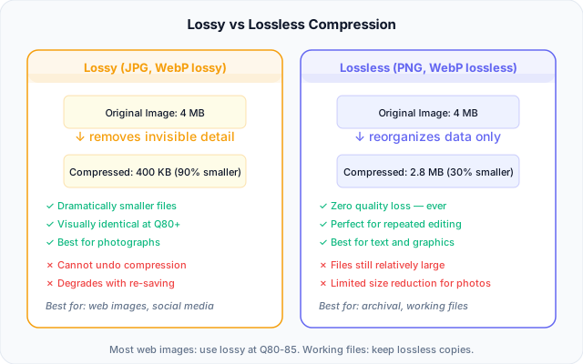
For the web, lossy wins in almost every scenario. Here's why:
Your images are displayed on screens at normal viewing distances. Nobody zooms to 400% and pixel-peeps your blog header. At normal viewing conditions, a well-compressed lossy image at quality 80 is visually indistinguishable from the original. But it's 70% smaller. That's bandwidth your users don't have to wait for.
The exceptions where lossless makes sense: screenshots with sharp text (lossy creates visible artifacts around letterforms), technical diagrams where every pixel matters, or source files you'll edit again later. For everything else — photos, illustrations, backgrounds, product images — lossy compression is the correct choice.
The Quality Slider Sweet Spot
Every image compression tool has a quality slider — usually ranging from 0 (maximum compression, terrible quality) to 100 (no compression, original quality). The relationship between that slider and actual visual quality is not linear. And that's the key insight most people miss.
Going from quality 100 to quality 80 reduces file size dramatically — often 60-75% — while producing output that looks identical to the naked eye. Going from quality 80 to quality 60 saves another chunk but starts introducing visible artifacts. Below 60, things deteriorate quickly.
The sweet spot for web images is quality 80-85. Here's why this range works:
At quality 80, the compression algorithm removes only the data that falls below human perceptual thresholds. Color variations between adjacent pixels that your eyes merge together anyway. High-frequency detail in areas where your attention never lingers. Subtle noise that the camera sensor introduced. None of this removal is visible at normal viewing conditions.
At quality 85, you get a tiny bit more headroom — useful for images with fine text overlays, thin lines, or critical brand elements where you want zero risk of visible degradation. The file size increase over quality 80 is only about 15-20%, which is worth it for hero images or product photography where quality perception matters.
Below quality 75, you start to see issues in specific content types: banding in gradients, smearing around high-contrast edges, and a general "waxy" look in skin tones. Some images handle it fine (abstract patterns, landscapes with natural noise), but it's no longer a safe universal setting.
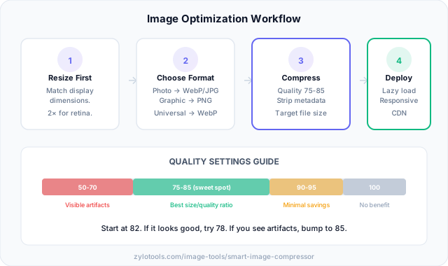
My recommendation: set your default to 80 and only deviate when you have a reason. Use 85 for hero images and key product photos. Use 70-75 for thumbnails, background textures, and decorative images that don't need to be pixel-perfect. Never go below 60 for anything a user will actually look at.
My Optimization Workflow
After compressing thousands of images across dozens of projects, I've settled on a four-step process that handles every situation. The order matters — each step builds on the previous one.
Step 1: Resize to actual display dimensions. Before touching compression, figure out the largest size this image will ever display. If your content column is 800px wide and you're on a 2x retina display, your image needs to be 1600px wide maximum. Not 4000px. Not "whatever the camera produced." Use an image resizer to get dimensions right first, because resizing alone can cut file size by 80% or more.
Step 2: Choose the right format. This decision dramatically impacts final file size. A photo as PNG might be 3MB. The same photo as WebP at quality 80 might be 180KB. I'll cover format selection in detail in the next section, but the short version: WebP for most things, JPG for maximum compatibility, PNG only when you need transparency or have sharp-edged graphics.
Step 3: Compress with appropriate quality. Now apply compression at the quality level that matches your use case. Hero images at 82-85. General content images at 78-82. Thumbnails and decorative elements at 70-75. The smart compressor handles this automatically by analyzing image content and selecting optimal settings.
Step 4: Implement lazy loading. Mark all below-the-fold images with loading="lazy". This doesn't reduce file size, but it eliminates unnecessary network requests during initial page load. Your hero image loads immediately. Everything else waits until the user scrolls near it. Combined with proper compression, this creates pages that feel instant.
Format Selection in 2026
The format landscape has shifted significantly in the past few years. Here's where things stand now and what you should actually use:
WebP is the default. Full browser support (yes, even Safari since 2022). Both lossy and lossless modes. Supports transparency. Typically 25-35% smaller than equivalent JPEG quality. There's no good reason not to use it for most web images in 2026. If you're still serving JPEG by default, you're leaving performance on the table.
JPG remains the fallback. Email clients, older content management systems, PDF generation, social media previews — plenty of contexts still expect JPEG. It's also the format most people understand intuitively. When you need maximum compatibility and don't control the viewing environment, JPEG at quality 80 is still solid.
PNG for specific needs. Transparency, screenshots with text, pixel art, graphics with fewer than 256 colors (where PNG-8 is incredibly efficient). Don't use PNG for photographs — you'll get files 3-5x larger than necessary. A PNG to JPG conversion or JPG to PNG conversion helps when you've got the wrong format.
AVIF as progressive enhancement. Even better compression than WebP — sometimes 50% smaller than JPEG at equivalent quality. The catch: encoding is slower, and browser support, while growing fast, isn't quite universal. Use it in a <picture> element with WebP and JPEG fallbacks for maximum performance on supporting browsers.
| Format | Best For | Transparency | Lossy | Lossless | Typical Size vs JPEG |
|---|---|---|---|---|---|
| WebP | Everything web | Yes | Yes | Yes | 25-35% smaller |
| JPEG | Photos, universal compat | No | Yes | No | Baseline |
| PNG | Graphics, transparency | Yes | No | Yes | 3-5x larger (photos) |
| AVIF | Cutting-edge performance | Yes | Yes | Yes | 40-50% smaller |
| SVG | Icons, logos, diagrams | Yes | N/A | N/A | Tiny (vector) |
The practical takeaway: convert your images to WebP as your default delivery format. Keep JPEG as a fallback for contexts where WebP isn't supported. Use PNG sparingly and intentionally. Experiment with AVIF if your audience uses modern browsers.
Compressing for Core Web Vitals
Google's Core Web Vitals are the metrics that actually determine whether your site ranks. And images are directly responsible for one of the three: Largest Contentful Paint (LCP).
LCP is tied directly to your hero image size. On most pages, the LCP element is either a hero image, a featured photo, or a large background image. If that image is 2MB, your LCP will be slow regardless of how fast your server or CDN is. The math is simple: a 2MB image on a 10Mbps connection takes 1.6 seconds to transfer — and that's after DNS, TLS, and server response time. Compress that to 200KB and transfer drops to 160ms.
Here's what matters for Core Web Vitals performance:
Preload your LCP image. Add <link rel="preload" as="image" href="..."> in your document head for the hero image. This tells the browser to start downloading it immediately rather than waiting until it discovers the image in HTML parsing. Combined with compression, this can shave 500ms+ off your LCP.
Don't lazy-load above-the-fold images. This is a common mistake. Lazy loading delays image loading until it enters the viewport — which is counterproductive for images that are already visible. Your hero image should load eagerly. Only below-the-fold images get loading="lazy".
Set explicit dimensions. Always include width and height attributes (or use CSS aspect-ratio). Without them, the browser doesn't know how much space to reserve, causing layout shifts as images load. This impacts Cumulative Layout Shift (CLS), another Core Web Vital.
Use responsive images. Serve different sizes based on viewport width using srcset. A mobile user on a 375px screen doesn't need your 2000px desktop image. Responsive images combined with compression mean mobile users might download a 50KB image instead of a 500KB one — a massive difference on cellular connections.
The fastest image is the one that never loads. The second fastest is the one that's been properly compressed, correctly sized, and delivered in an efficient format. Get these fundamentals right and your Core Web Vitals improve dramatically.
Common Mistakes That Kill Page Speed
I've seen every possible image performance mistake. These are the ones I encounter most frequently — and they're all easily fixable.
Serving originals directly from the upload folder. The photographer delivers a 12MB TIFF. Someone converts it to a 6MB PNG and uploads it. It gets served to every visitor, on every device, at full resolution. I've seen single blog posts that transferred 40MB of images because nobody ran them through a compressor first. Five minutes with the image compressor fixes this permanently.
Using the wrong format for the content type. Screenshots as JPEG (blurry text, artifacts everywhere). Photos as PNG (files 4x larger than necessary). Simple logos as full-resolution raster images instead of SVG. Each wrong format choice costs kilobytes — or megabytes — of unnecessary data transfer. Learn the differences between JPG and PNG and how WebP compares to make informed decisions.
No lazy loading anywhere. A blog post with 15 images loads all 15 on page load, even though only 2-3 are visible without scrolling. Adding loading="lazy" to below-the-fold images is a one-attribute change that prevents megabytes of unnecessary initial downloads.
Ignoring mobile entirely. Desktop images served to phones. A 2000px-wide hero image displayed in a 375px viewport. The browser downloads the full file, then scales it down — wasting bandwidth and battery on processing pixels that will never be seen. Use srcset or at minimum, resize images to reasonable dimensions.
Compressing once, never again. You optimized your images two years ago. Since then, new formats emerged (WebP went universal, AVIF matured), new content was added without optimization, and your initial "optimized" images are now outdated. Image optimization isn't a one-time task — it's an ongoing practice, especially as formats improve.
Relying on CSS to hide the problem. Setting max-width: 100% makes images display correctly, but it doesn't reduce the amount of data transferred. The image still downloads at full size. CSS resizing is visual only — it doesn't save bandwidth.
Frequently Asked Questions
How much can image compression reduce file size?
It depends on the content. Photos with large uniform areas like sky or backgrounds compress heavily because there's less unique data to preserve. Textured images with lots of fine detail compress less effectively. For most web photos, expect 60-80% file size reduction at quality 80 without any visible difference to the human eye.
Does image compression affect SEO?
Yes, and positively. Faster pages rank better — this isn't speculation, it's a confirmed Google ranking signal. Largest Contentful Paint directly correlates with hero image file size on image-heavy pages. Google explicitly recommends serving optimized images in their PageSpeed documentation and Lighthouse audits.
What's the best image format for websites?
WebP is the default choice for modern web delivery because it offers the best balance of file size and visual quality with full browser support. Use JPG when you need universal compatibility with older systems or email clients. PNG remains necessary for transparency and sharp-edged graphics. Consider AVIF as a progressive enhancement for browsers that support it.
Can I compress images without any visible quality loss?
Yes, absolutely. Metadata stripping alone removes 5-50KB per image with zero visual change. Lossless compression modes reduce size further without touching pixel data. For lossy compression, quality settings between 80-85 produce output that is visually identical to the original for most viewers at normal display sizes and viewing distances.
How do I compress images for email?
Resize to 1200-1600px on the longest side first — most email clients display images at much smaller sizes anyway. Export as JPG at quality 70-80, which keeps things sharp while hitting reasonable file sizes. Aim for 200-500KB per image. This ensures fast send and receive times without making images unusably small or blurry.