PNG vs JPG: Differences, Quality & When to Use Which
I used to save everything as PNG because it "kept quality." Every icon, every photo, every background image — all PNG. Then I checked what that habit was doing to my page load times. A single hero image was 4.8 MB. The equivalent JPG at quality 85? 280 KB. Same visual result to anyone who wasn't zooming in at 400%.
That was the moment I realized this isn't about which format is "better." It's about which format is right for this specific image. And after building hundreds of websites and optimizing thousands of images, I've found that the decision is simpler than most guides make it.
Here's everything I've learned — the quick rule, the edge cases, and the mistakes I still see designers making every week.
The one-sentence rule that covers 90% of cases
Photo? JPG. Everything else? Probably PNG.
That's it. That single heuristic will give you the correct answer the vast majority of the time. And the reason it works is actually pretty logical once you understand what each format was designed to do.
JPG was built from the ground up to compress photographs efficiently. Its entire compression algorithm is optimized for the kinds of patterns found in real-world imagery — gradual color gradients, organic textures, natural lighting transitions. It exploits the fact that photos contain tons of redundant visual information that human eyes can't distinguish anyway.
PNG was designed for everything that isn't a photo. Sharp text. Clean lines. Flat color areas. Transparent backgrounds. The things that JPG compression actually makes worse.
So the heuristic works because it aligns with what each format was literally engineered to handle. But about 10% of the time, things get nuanced. A screenshot that's mostly a photograph. A product image on a transparent background. An infographic mixing photos with text. Those edge cases are what the rest of this guide is for.
What's actually happening inside each format
You don't need a computer science degree to understand this. But knowing the basics helps you predict how each format will handle your specific image.
JPG: strategic data removal
When you save a JPG, the algorithm divides your image into tiny 8×8 pixel blocks. For each block, it analyzes the color patterns and throws away the subtle variations that human vision can't reliably detect. It keeps the broad strokes — the overall color, the major transitions — but discards the fine details.
This is why JPG works brilliantly for photos. A photograph of a forest has millions of slight green variations between leaves. Your eyes can't distinguish most of them. JPG says "these 47 slightly different greens? I'll represent them as 12 greens." The file shrinks dramatically and you literally cannot tell the difference.
But give JPG a crisp black letter on a white background? Those 8×8 blocks create visible smearing around the edges. The algorithm sees the sharp black-to-white transition and tries to "smooth" it, producing ghostly gray halos that look terrible.
PNG: nothing gets thrown away
PNG compression works completely differently. It finds patterns in the pixel data and represents them more efficiently — like replacing "white white white white white" with "white × 5" — but never discards any information. Every single pixel comes back exactly as it was.
This is why PNG files are larger for photos. A forest photograph has very few repeating patterns at the pixel level. Every leaf is slightly different. PNG can't find much to compress, so the file stays big. But give PNG a screenshot with large areas of solid color, consistent backgrounds, and clean text? It compresses beautifully because those repeating patterns are everywhere.
When JPG is the obvious choice
There are situations where reaching for JPG shouldn't even require thought. It's just correct.
Photographs of any kind. Portrait sessions, landscape shots, event photography, food photography — if a camera captured it, JPG is almost certainly the right delivery format. The compression algorithm was designed for exactly this type of content.
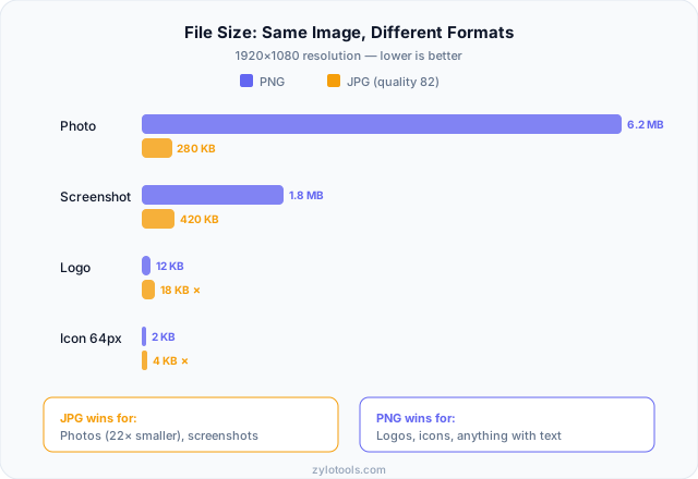
Hero images and page backgrounds. These are typically large-dimension images that would be enormous as PNGs. A 1920×1080 hero image might be 6-8 MB as PNG but only 200-400 KB as JPG at quality 80-85. Your visitors will thank you.
Social media images. Platforms recompress everything anyway. Start with a high-quality JPG and let the platform handle the rest. Uploading a 15 MB PNG just means slower upload times before it gets converted to JPG on their servers regardless.
Product photos for e-commerce. Unless your product images need transparent backgrounds (then PNG), the compression advantage of JPG means your product pages load faster. For stores with hundreds of product images, this adds up massively. An image compressor can help squeeze even more out of your JPGs.
Blog post images and article illustrations. If you're embedding photographs or photographic content in articles, JPG keeps your page weight reasonable. Pair it with an image resizer to serve appropriately sized versions.
When PNG is the only right answer
Sometimes there's no debate. PNG isn't just better — it's the only format that will produce acceptable results.
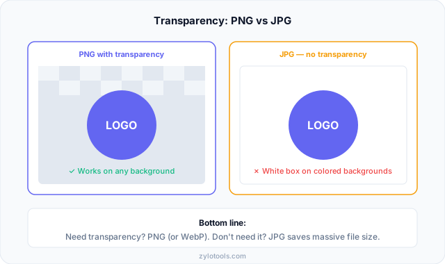
Logos on different backgrounds. Your logo needs to sit cleanly on white, dark, colored, and patterned backgrounds. That requires transparency. JPG can't do transparency. End of discussion. If you try to save a logo as JPG, you're stuck with a white (or whatever color) box around it that clashes with any non-white background.
Screenshots with readable text. I've seen developers save documentation screenshots as JPG and the text becomes a blurry, artifact-ridden mess. Text needs pixel-perfect edges. PNG delivers that. JPG smears it. Every time.
UI elements and icons. Buttons, icons, interface elements — these have clean edges, flat colors, and often transparency. PNG handles them perfectly at tiny file sizes. JPG would add artifacts AND often produce larger files for simple graphics (yes, really).
Images you'll edit multiple times. Working files should always be PNG (or your editor's native format). Every time you save a JPG, it recompresses and loses more quality. Save as JPG only as the final export step, never as your working format.
Diagrams, charts, and infographics. Anything with text labels, clean lines, and flat color areas. PNG preserves the crispness that makes these readable. JPG turns clean lines into fuzzy approximations.
The mistakes I see on almost every website
After auditing hundreds of sites, certain mistakes come up so often they're practically universal. Here's what I keep finding — and what it's costing those sites.
Saving photos as PNG
This is the number one mistake. Someone exports a photograph as PNG because they heard "PNG is higher quality." Technically true — but irrelevant. At normal viewing sizes, a JPG at quality 85 is visually indistinguishable from the PNG version. The difference? The PNG might be 4 MB. The JPG is 350 KB. Multiply that across 20 images on a page and you've added 70+ MB of unnecessary bandwidth.
Your visitors on mobile connections will leave before the page loads. Your Core Web Vitals will tank. All for "quality" nobody can see.
Saving logos as JPG
The opposite mistake, and it looks terrible every time. A logo saved as JPG develops visible compression artifacts — blurry halos around text, smeared edges on sharp graphics, and color bleeding where clean boundaries should be. Even at quality 100, JPG introduces subtle degradation on graphics with sharp edges.
Not considering WebP as a third option
Many designers are still stuck in the PNG-vs-JPG binary when WebP now handles both use cases at smaller file sizes. It's not always the right choice (more on that below), but ignoring it entirely means missing easy performance wins. Our WebP converter makes it trivial to try.
Re-saving JPGs repeatedly
Every time you open a JPG, edit it, and save it as JPG again, you're recompressing already-compressed data. The quality degrades with each cycle. It's like making a photocopy of a photocopy. After 5-10 cycles, the degradation becomes obvious — especially around text and high-contrast edges.
Here's the decision flowchart I actually use
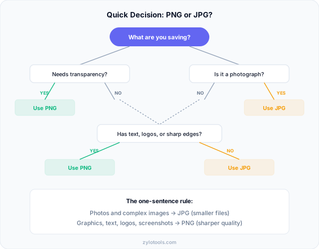
Forget complicated matrices. When I need to pick a format, I run through these questions in order. The first "yes" gives me my answer.
Does it need transparency? → PNG. No other mainstream format does this as reliably (WebP also works if you're serving to modern browsers only).
Is it a photograph or photographic in nature? → JPG. Even mixed content that's predominantly photographic gets better results with JPG.
Does it contain text that needs to stay readable? → PNG. This includes screenshots, diagrams with labels, infographics, slides, and documentation images.
Does it have sharp edges, flat colors, or geometric shapes? → PNG. Logos, icons, illustrations, UI mockups, line art.
Will you re-edit and re-export this image? → Keep your working file as PNG. Export to JPG only at the end.
Is file size the primary concern and quality is secondary? → JPG at a lower quality setting. You can always go lower on the quality slider if bandwidth matters more than perfection.
That covers it. Six questions, always asked in that order. The flowchart below visualizes the same logic as a decision tree:
What about WebP? Should you skip both formats entirely?
WebP is genuinely impressive. It does lossy compression better than JPG (smaller files, same quality). It does lossless compression better than PNG (smaller files, same pixel-perfect accuracy). And it supports transparency. It's both things in one format.
Browser support is no longer an excuse to avoid it. Over 96% of web users now have WebP support in their browser. Chrome, Firefox, Safari, Edge — they all handle it natively. The days of needing fallbacks for most audiences are over.
When to go all-in on WebP
If you're building a modern website and your audience uses current browsers, WebP is almost always the right choice for web delivery. You'll get smaller files across the board — both for photographic content and for graphics with transparency. It's genuinely a better format for the web.
When JPG and PNG still matter
Email newsletters. Many email clients still don't render WebP. Print workflows. Design software and printers expect JPG, PNG, or TIFF. Legacy systems and APIs that specifically require JPG or PNG. File sharing where the recipient might be using older software. Social media platforms that may recompress WebP in unexpected ways.
My approach: I keep master files as PNG (lossless), deliver on the web as WebP where possible, and fall back to JPG/PNG for email and offline use. Check our WebP vs JPG comparison for a deeper dive, or try the WebP converter to see the file size difference for yourself.
How to convert between formats without ruining quality
Sometimes you're stuck with the wrong format and need to convert. Here's how to do it without making things worse.
PNG → JPG
This is the most common conversion. You have a large PNG and need a smaller JPG for web use. The key decisions:
Quality setting: Start at 85. Look at the result. If it's visually identical, try 80. If you see artifacts, bump to 90. For most photographic content, 82-88 is the sweet spot where files are small but degradation is invisible.
Transparency handling: JPG can't do transparency, so any transparent areas need a background color. White is the default, but choose whatever matches where the image will be displayed. Our PNG to JPG converter lets you pick the background color before converting.
When not to do it: Don't convert if the PNG contains text you need to stay crisp, if you'll need to edit the image again later, or if the PNG is already small (simple graphics often produce larger JPGs than PNGs).
JPG → PNG
Important thing to understand: this doesn't restore quality. If a JPG has compression artifacts, converting to PNG just preserves those artifacts losslessly. The damage is baked in.
But it does prevent further degradation. If you need to edit a JPG multiple times, convert to PNG first, do all your editing in PNG, then export a final JPG when you're done. One round of lossy compression instead of five.
Also useful when you need to add transparency to an existing image — convert to PNG, then remove the background in your editor.
The file size difference (with real numbers)
Theory is nice. Numbers are better. Here's what you can realistically expect when saving different types of images in each format:
| Image Type | PNG Size | JPG (Q85) | Winner |
|---|---|---|---|
| Photo (1920×1080) | ~5-8 MB | ~250-400 KB | JPG (15-20x smaller) |
| Screenshot (1440×900) | ~400-800 KB | ~300-600 KB | Close — PNG preserves text |
| Logo (500×200) | ~15-40 KB | ~25-60 KB | PNG (smaller + transparency) |
| Icon (64×64) | ~2-5 KB | ~3-8 KB | PNG (smaller + crisp edges) |
| Infographic (800×2000) | ~200-500 KB | ~150-350 KB | PNG (text readability) |
Notice the pattern? For photographs, JPG dominates on size. For everything else, the size difference is small — and PNG's quality advantages usually outweigh the marginal size increase. The only time choosing PNG for photos makes sense is for archival purposes where file size doesn't matter.
Want to see these differences with your own images? Run them through our smart image compressor and compare the output sizes across formats.
Frequently Asked Questions
When should I use PNG instead of JPG?
Use PNG whenever your image needs transparency — logos, icons, overlays, anything that sits on different backgrounds. Also choose PNG for screenshots with readable text, UI elements with sharp edges, diagrams with clean lines, and any image you'll need to edit and re-export multiple times. If the image has flat colors, geometric shapes, or text, PNG will look better and often be smaller than JPG anyway.
Why are PNG files so much larger than JPG for photos?
PNG uses lossless compression — it keeps every pixel exactly as-is and just reorganizes the data more efficiently. JPG uses lossy compression that permanently removes visual information your eyes probably can't detect. For photos, which have complex color patterns with few repeating pixel sequences, PNG can't find much to compress. JPG's willingness to approximate and discard gives it a massive advantage, typically producing files 10-20x smaller for photographic content.
Can I convert PNG to JPG without losing quality?
Technically, some loss is inevitable — JPG is lossy by definition. But at quality 90+, the loss is invisible to human eyes under normal viewing conditions. You won't see a difference unless you zoom in to 400% and compare pixel-by-pixel. The real concern isn't visual quality but transparency: any transparent areas become a solid color (usually white). Always keep your original PNG master file so you can re-export later if needed.
Is WebP better than both PNG and JPG?
For web delivery, yes. WebP achieves smaller file sizes than JPG for lossy compression and smaller than PNG for lossless, while supporting transparency. Browser support is now over 96%, so compatibility is rarely an issue for websites. However, WebP isn't universally supported in email clients, print workflows, or older design software. If your images stay on the web, WebP is usually the best choice. For anything else, JPG and PNG remain necessary.
Does converting between formats repeatedly damage the image?
It depends on direction. JPG → PNG is completely safe — you're making a lossless copy of whatever quality exists. No new damage is added. PNG → JPG introduces one round of lossy compression. The real danger is repeated JPG → JPG saves: each re-save recompresses already-degraded data, compounding the artifacts. After several cycles, degradation becomes obvious, especially around text and high-contrast edges. Always keep a lossless master.
What quality setting should I use when saving JPG?
For web use, quality 80-88 is the sweet spot for most photographs — visually identical to the original at a fraction of the file size. For images with text or fine detail, bump to 90-95. Below 70, artifacts become noticeable on most images. Above 95, file sizes increase dramatically with minimal quality gain. I default to 85 and only adjust if the specific image looks wrong or the file is still too large.